

Windows 8 launched on October 26 and it has been reported as Microsoft's most important product launch with a massive marketing campaign said to cost between $1.5-$1.8 billion, making it also the largest product launch in the history of the tech industry.

With the release of the all the new windows 8 came an all new redesign, something never before seen in the history of Microsoft's branding, but ironically, based on the company's metro design principles. First is the logo of the OS itself. Gone is the wavy, 'flag-ish' signature brandmark for windows. Its now minmalist clean lines and I have to say, I love it!! The beauty of it comes in the fact that for once, it actually looks like a real, bona-fide WINDOW!! Designed by Pentagram’s Paula Scher, "the logo re-imagines the familiar four-color symbol as a modern geometric shape that introduces a new perspective on the Microsoft brand." For more on the development of this iconic brand mark check out the work on Pentagram's site.
N.B. Pentagram is the world's largest independent design consultancy. The firm is owned and run by 19 partners, a group of friends who are all leaders in their individual creative fields.
No more extravagant gradients and mind numbing graphics that we have grown accustomed to but its now a totally different direction.
| new windows logo |
| old windows icons |
Next is the user interface of the new OS- notably the start screen.
 |
| new windows start screen |
 |
| remember this guy? old windows start menu |
No more circular blob at the bottom left corner of your screen, nope, it has 'moved-on-up" literally. Now on the top left, the start menu and screen are more or less one and the same. I can't see the usual 'folder' gui's that are so glossy and 'graphicy!' just simple single colour icons that have been exquisetely designed against a grid structured layout. For more on the icon design check here.
So you've seen the new logo, the new interface, now lets see some hardware.
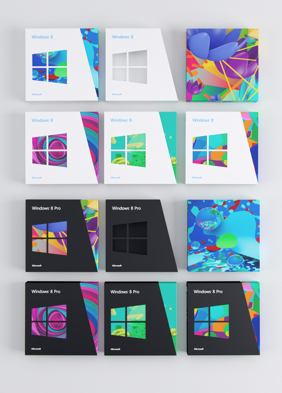
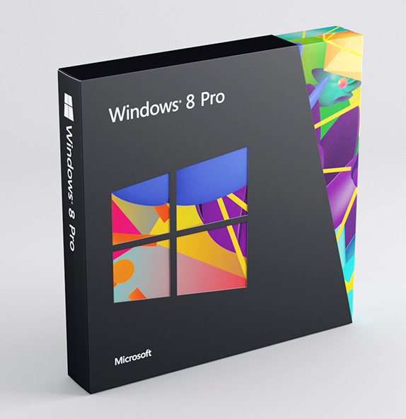
First up, the packaging.
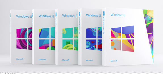 |
| If you are not in love by now, you need to get yourself checked. |
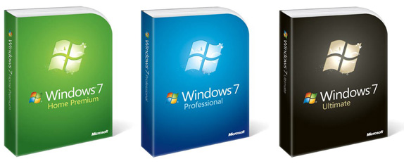 |
| old soldier packaging from Microsoft |
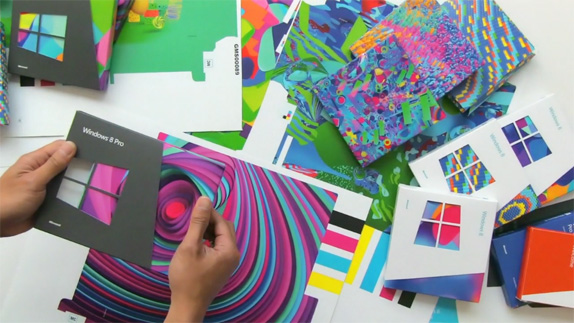
Though the logo was designed by pentagram, Microsoft deemed it fit to get 3 different agencies and an independent to handle the packaging. Wolf Ollins, the infamous olympic logo designers, serve as the 'curators' of the re-branding effort which extends beyond just this packaging. The structural construction of the packaging is handled by IDEO and the packaging artwork and illustrations were done in part by colours and the kids. Todd Selby handled brand imagery and video.
Next up, Hardware. Now Microsoft have been known for some hardware but really were no competition for the likes of apple, hp, and samsung.
 |
| The Bulky,
$1,000,
Mira display that let users
wirelessly access their PC from 100 feet away, didn't make it. |
 |
| Windows Mobile, 2003 retired in 2010 by the smartphones of apple, google and friends. |
 |
| Microsoft’s response to the iPod, The Zune. Not as sleek as its competitor. |
They're looking at changing that now and with what they're coming out with, they just might.
 |
| new sleek microsoft hardware |
 |
| new windows phone 8 |
 |
| the star of the show, the Microsoft surface |

 |
| don't you just love those speakers? |
Finally there's is the issue of marketing this mammoth. The messaging and communications for this rebrand are very succint. Theres no beating about the bush, its straight forward and clearly designed. The use of the 'window in perspective' form borrowed from the logo creates a befitting, well..., 'window' for the images used in the marketing communications, images that have been described as "energetic, global, lifestyle photography..." with simple clean sans serif typography and a colour palette that draws from the Metro design language of Microsoft.


For more on the microsoft and windows rebrand stay in tune with us, brand new, wolf ollins, the official microsoft blog and fastcompany. Its thanks to them we have so many images up here.
I'm in love with the new brand. It's been a long time coming. I've been using windows 8 on my PC since the released the test edition. I reported some kinks, but otherwise, it's a lovely piece of work. I'm however very skeptical about its success.
ReplyDeleteIf you follow microsoft's 'hit&miss' trends then....
win 95-just ok...win 98-awesome...win ME/2000-rubbish...win XP-awesome...win vista-rubbish...win 7-awesome...win 8-rubbish???
time will tell i guess. great write up