
Designing for the olympics is probably one of the most coveted projects any designer or agency could dream of, but designing for the olympics in London, which is known for its design prowess just maybe a challenge. Some years back, the bad boys of brand design, wolf ollins (i like to call 'em that, cuz they're just so controversial) wowed some and riffled others when they took on this challenge to brand the 2012 olympics, it was met with some degree of criticism but we'll get to that later, however, ... to me?
.................their solution?, ........ WOW!!
*WARNING: THERE'S A FAIR AMOUNT OF EYE CANDY ON HERE, SO GET YOU MOUSE WHEELS READY AND PREPARE TO SCROLL!!!!!!!*

I've always believed that Branding was about creating compelling experiences, and not just how snazzy a logo looks, with that said, Wolf Ollins certainly did achieve creating an outta-dis-world design scheme and theme that even a 2 year old could build upon to achieve a memorable experience. Memorable, that word is one of the many that would describe the mind-boggling, bold and brash approach to designing for an event that usually has a somewhat safe and easy on the eye look and feel...

"London's bid for the 2012 Olympic and Paralympic Games was like no other. It promised to inspire the youth of the world. To engage, involve and enthuse - to change lives. To achieve this, London's Organizing Committee needed a powerful brand, one that could inspire and engage with a global audience of four billion people, and could make the Games more relevant, accessible and inspiring than ever."
like i said, 'lofty'.
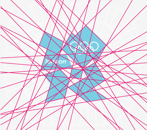
Wolf Ollins had to create something that would "encourage people to challenge themselves to try new things, to go further, to discover new abilities." and they did just that with what has been described as " unconventionally bold, deliberately spirited and unexpectedly dissonant"...and in relation to the host city..." echoing London's qualities of a modern, edgy city", most especially for the fact that the logo did well " Containing neither sporting images nor pictures of London landmarks, the emblem shows that the Games are more than London, more than sport. The Games are for everyone, regardless of age, culture and language." . For more of this well written copy refer to the wolf ollins case study page.
The love continued with Jacques Rogge, the International Olympic Committee President, emphatically stating
"This is a truly innovative brand logo that graphically captures the essence of the London 2012 Olympic Games."
The typeface to go with this triumph was initially a befitting 'spiky typeface', Klute, designed by london based typefoundry and graphic design agency Alias, but rather than settle, the typefoundry were called in to create
a custom typeface befitting the logo.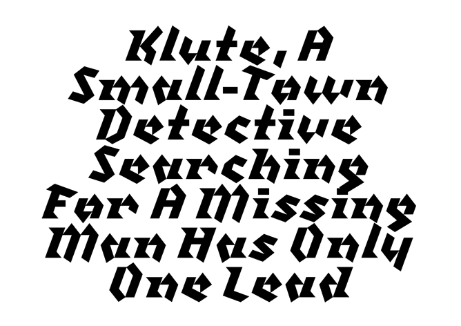
In the words of Alias,
"The typeface was designed to work within and support the pre-defined system of angles and shapes, to capture a spirit of simplicity, modernity and angular geometry. As the logo was a mix of angles, so it made sense for the type to be also, using examples of handwritten lettering and modular, linear and conceptual typography as references. The idea was to take these two separate, disconnected ideas and combine them, so a ‘handwritten’ type built from straight lines arranged in a limited set of angles and shapes."
For more of the gist see Alias' website.


The intention was to create a type that was "dramatic, impactful and characterful" useable at large sizes and capable of making a unique statement. They most definetely suceeded as the typeface went to be one of the most notably consistent features in the implementation of the brand, from track numbers to signage.
The result...


 |
| variations of the 2012 london olympics logo by wolff olins |

When it was 500 days to the start of the olympics, a work of art in form of a time piece from outer space was unveiled by the organising committee and the official timekeepers of london 2012, OMEGA..


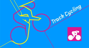
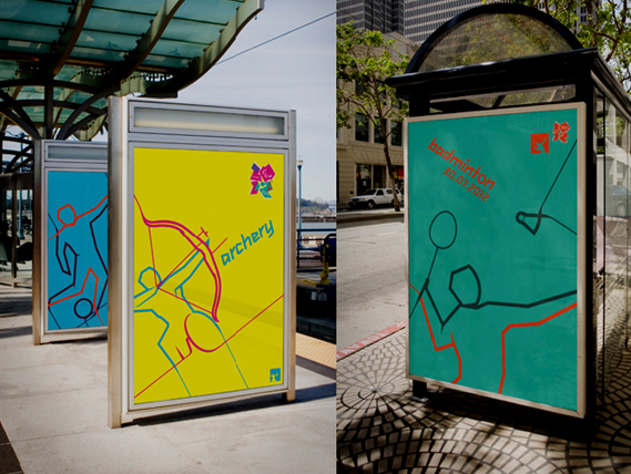
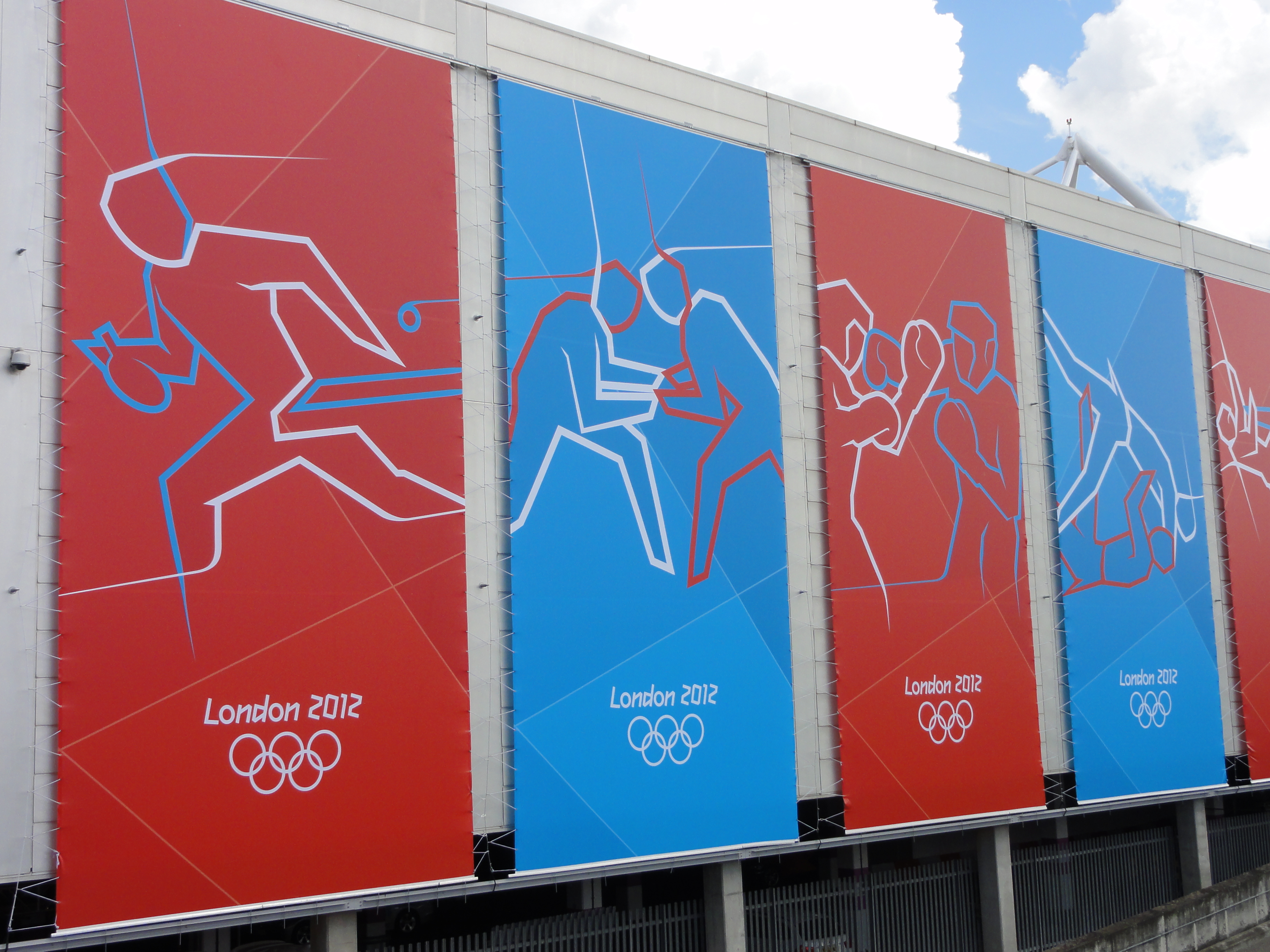
As with every olympics, there would be need for pictograms to represent each sporting event during the games. Someone was called in to deliver these.......no thats the name of the british design agency that created the london 2012 pictograms, someone. They were summoned to create pictograms that 'befitted' the envisioned brand identity but at the same time were fresh and exciting. Once again, a lofty task, but they came out victorious with lots of important people singing their praise as can be read here.

The pictograms were fluid yet angular, they had a sense of motion which is a departure from the traditionally static pictograms of the past, most notably those of the Munich games of '72 from which some degree of inspiration was drawn. They not only event identifiers but proved to be versatile due to their 'mobility' and were applied on posters and nice tees, ultimately leading the ad campaign promoting ticketing for the games...


f.y.i, someone was responsible for the creation of Heineken's first soft drink...Fayrouz, so the next time you're guzzling down a cold bottle of that pineapple flavoured goodness, think of someone (pun most gloriously intended)!!
Now on to the dynamic, ever evolving applications, oh Boy!!! The vision of wolf ollins was carried through by none other than FutureBrand (the creators of that 'whirlpool' zain logo from back in the day) to create an identity for the ages!!! There assignment, as 'OFFICIAL MARKETING SERVICES PROVIDER' came as far back as 2009, and was dubbed "the biggest assignment in the history of UK marketing". Suffice to say, they delivered. They were in charge of creating 'the Look' of London 2012 having taken cue from the work of wolf ollins, as well as "a compelling brand strategy and kit of parts". Why this was such a daunting task wasn't just that they had to carry through branding an entire, very prominent world city and its people, but the fact that there work would determine how the games were percieved in 2012 and how they would be remembered for years to come.
Futurebrand went to work developing and designing everything from event tickets to stadium seating all while staying true to what wolf ollins had envisioned.


To complement the 'shard' seating, stadium wraps based on the 56 selected colours within the palette were created by sophie smallhorn, numbering about 300 (DAMN!!) to create slit like entrances into the stadium.

Futurebrand was instrumental in the design of those pesky papers that get you in to see Hussien Bolt break his own records...the tickets.


Each one sporting a 'someone-designed' pictogram infused with the consistent 'shard' theme from wolf ollins printied in varying colours one for each sport, along with images of the venues as well as a hologram and a barcode as security measures. This would ultimately allow for accountability and make getting into the arenas without a ticket like breaking into fort know. Even if you did manage to outsmart the barcode and hologram, how would look trying to get in to the basketball arena with a ticket for equistrean sports...smart!?
They were also responsible for vehicle wraps for the olympic fleet from airplanes to the official olympics bmw's.

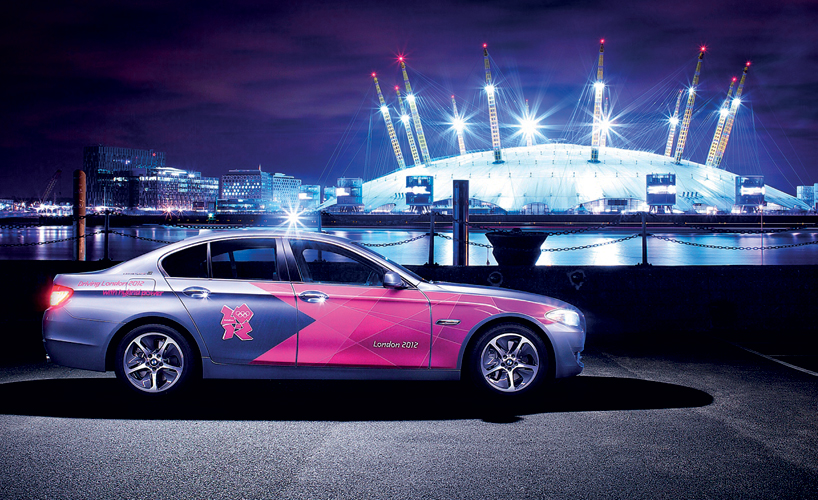

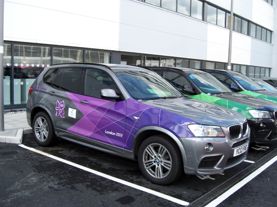
Probably most notable from the fleet would be the vehicles from the olympic torch relay in their distinctive
gold palette as well as a refined version of the logo.


The torch relay fleets brings me to the torch itself, for which the design was passed on to (pun inteded) yet another London-based design team, Barber Osgerby. The result was an elegant yet bold blend of form and texture that slightly departs from the 'shard' theme but no matter, it still looks stellar.


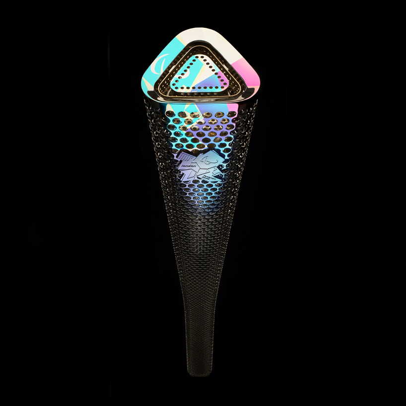 |
| the paralympic torch |
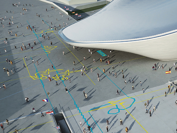
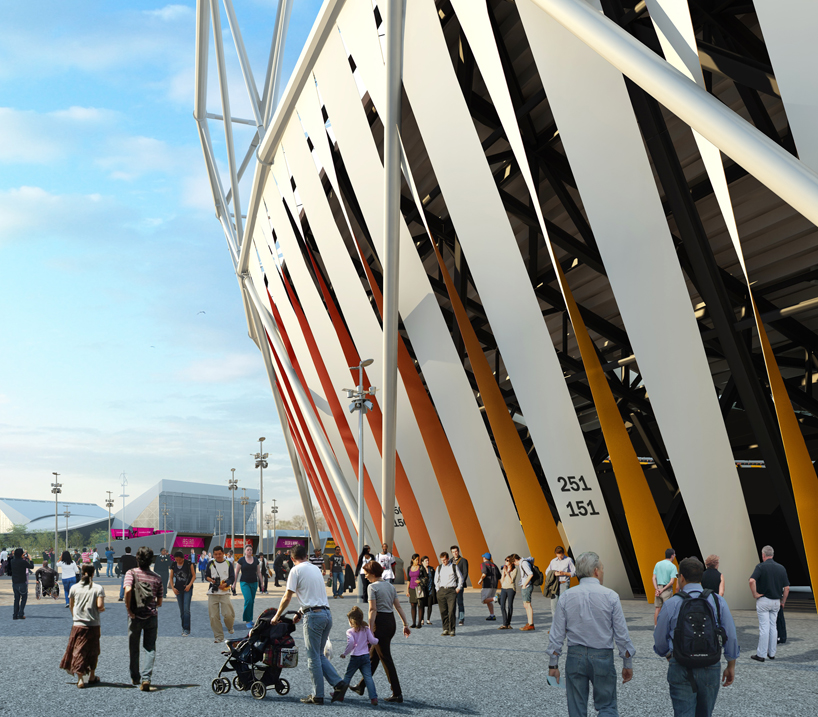
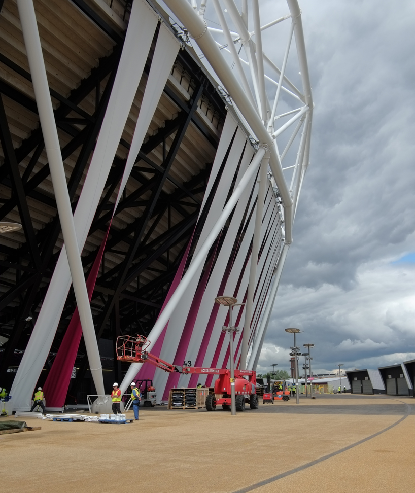
Now to enjoy the opening ceremony where the torch is finally passed to, you would need a stadium and to get the people of London to the stadium you would need wayfinding and signage, Very badass wayfinding and signage !!! This was a job for surface architects and yes you guessed it, they are London based. These guys took signage design to a whole 'nother, other worldly level while staying true to what the visioneers at Ollins had intended.
The design followed the shard pattern to create a family of sharp, distinctive, prominent and intimidating structures from large pedestal based monuments to bus park signs and my personal favourite the entrance gantry to the olympic stadium...


The distinct palette of pink stands out in the streets and environments and literally forces you to notice it, add that to the distinctive geometry and form and no matter how lost you may have been, these signs will get you to where you're going!!
So you've seen the opening ceremony, bought your tickets, watched USA embarass Nigeria in Basketball and Hussein Bolt do the victory dance, what next? get the man his medal(s)....(Mike Phelps anyone!?).
Another British design icon, artist/designer David Watkins won the right to design the prize and glory of the olympics.


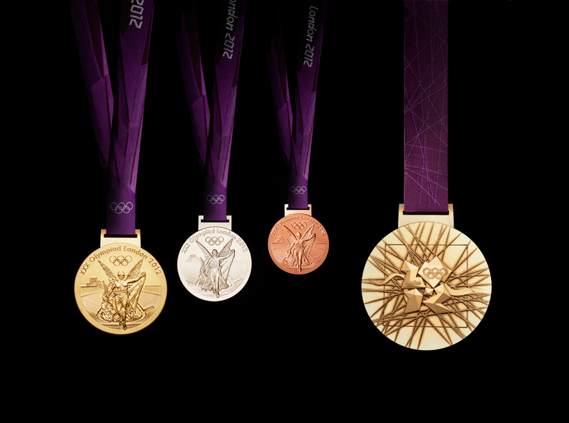
The sharp and edgy 3 dimensional feel of the embossed 2012 logo along with its flurry of lines and geometry on the rear face of the medal is just a beautiful sight to behold. As always, the front shows the same imagery at the summer games – the greek goddess of victory, nike, stepping out of the depiction of the panathinaiko stadium to arrive in the host city.
The Paralympic medals, meawhile, are designed by jewellery designer Lin Cheung who has used the reverse canvas as a representation of forward flight, power and lightness.
The ribbons for both medals were designed by Future brand.

For an in-depth article on the design and production of the medals go here.
Now what would medials be without a podium to wave and gloat from, while a smartly dressed lady (or guy) bears your bouquet . The Podia (totaling 40 in number) as well as ceremonial costumes were designed by 5 students of the famed Royal College of Art (RCA) in October of 2011 along with the look of the victory ceremonies, were the gloating occurs. The ceremonial costumes were created by Thomas Crisp and Trine Hav Christensen.


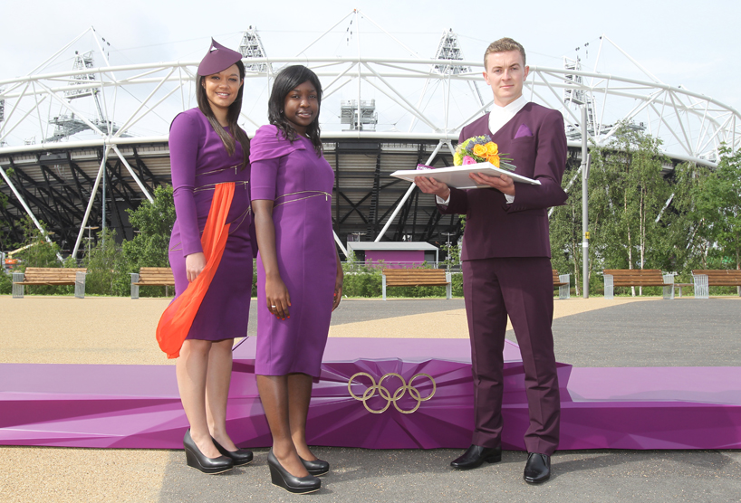


When designing the podia, the team of students - Gaetano Ling, Hong-Yeul Eom, Luc Fusaro, Heegun Koo
and Yan Lu - used dynamic lines representing the energy that the games and athletes represent., yes, all 4,400 medal-winning athletes that stood on them to formally celebrate their victory. For more on the podium and costumes check this article out...and this one to.


The cohesion and dynamism of it all to me is quite breath taking and supremely impressive.
One thing that still amazes me at this point is the degree of consistency within all the schemes despite the fact that a good number of people of varying professions and capacities were involved in the design and implementation of the brand....
- Wolf Ollins
- Alias
- Someone
- Future Brand
- Sophie Smallhorn
- Barber Osgerby
- Surface Architects
- David Watkins
- Lin Cheung
- the 'victory team'- Gaetano Ling, Hong-Yeul Eom, Luc Fusaro, Heegun Koo and Yan Lu
Unfortunately, nothing good is without some degree of infamy. Now when the logo was unveiled in 2007 it was met with much disdain and derision with people claiming their toddler children could do better, more so with the £400,000 price tag that was placed on it. The bad press was enough to make anyone fold, but the badboys of branding and design that are wolf ollins stuck to their guns, able to see what lay ahead and what would become of the logo despite the media onslaught and petitions.


The logo even came under religious fire with Iran threatening to boycott the olympics, stating that the logo spells out the word 'Zion', (how now?), which is a biblical term for 'Jerusalem'. It was even related to the infamous swastika, (the nazi symbol, and again i say, how now!?)

To say the LONDON 2012 BRAND succeeded would be an understatement seeing as 20 million tickets were sold with 2.1 million paralympic games tickets being sold before the start of the paralympics. This was a design triumph for all parties involved and is sure to go down in history as one of the most innovative examples of design and possibly the 'standard by which olympic design should be measured'.
I leave you with an ad from the official sports wear partner of the games adidas...

IMPOSSIBLE IS NOTHING.
shoutouts/notable sources and links...
http://www.wolffolins.com/work/london-2012
For a similarly well written article check out designboom's take
Creative review also had some nice things to say, here and here.
many thanks to the above for a good number of the images included in this post. God bless.
You really did your home work with this. very in depth and enlightening.
ReplyDelete