

I still remember trips to Mr.Biggs with my dad on Fridays
after school for meatpie and doughnut. Good Ol’days. But over time, Mr.Biggs
faced competition from up starts and startups that literally took away its
regular customers, like me. So they sought to reposition themselves to get
these customers back in the most sensible manner-a complete rebrand. It has
been 2years+ since this rebrand and I think it about time it was addressed. The
rebrand saw the fast food giant lose the capital B that we have all grown
accustomed to and settle for something they were led to believe was
‘contemporary’. Well, they had a mission to accomplish with this rebrand and I
must say, they missed it. Here’s why…
This is an excerpt from a report in Thisday, (‘New ‘Mr Bigg’s to Benefit Consumers’ By Raheem Akingbolu 05 Nov 2010)
This is an excerpt from a report in Thisday, (‘New ‘Mr Bigg’s to Benefit Consumers’ By Raheem Akingbolu 05 Nov 2010)
“As
a customer focused company, with a
brand essence that focuses on satisfying
the taste needs of our customers, we are now more than ever, poised to
deliver on our promise to consolidate our leadership position….We want our
numerous customers and all of Nigeria to know that their Mr. Bigg’s brand is
alive, exciting and always improving,… objectives of the rebranding project
include reinforcing the leadership
position of Mr Bigg's and Village Kitchen, creating a new excitement around the brand and re-connecting with the
brand’s primary target – children. Mr. Bigg’s loves children and
promotes family bonding…”
Now Mr.Biggs’ primary target demographic has been defined
clearly as Children and family. But which part of this rebrand has that catered
to? Tell me cuz I don’t see it! Some may or may not be aware that Mr.Biggs has
a mascot (some scary looking clown thingy) and what I perceive as an official
partnership with HIT entertainment, the guys behind BARNEY and friends(see organised events here) . So I
wonder why these factors weren’t leveraged in the re-brand. The various touch
points for me are less than satisfactory for a 25 year-old mega brand of this
stature.
Mr. Bigg's is Nigeria's first chain of fast food restaurants. Owned by conglomerate United African Company of Nigeria PLC, there are currently around 170 locations in Nigeria, including the country's first drive-through restaurant, with another four locations in Ghana. The restaurant is styled after McDonald's, and is known for its red and yellow colour scheme and meat pies. Mr. Bigg's history begins with the coffee shops inside Kingsway Department Stores in the 1960s. In 1973, these shops were rebranded as Kingsway Rendezvous, which became Mr. Bigg's in 1986. The chain saw rapid expansion after becoming one of the first Nigerian companies to sell franchises to investors. Mr. Bigg's specialty is the meat pie. A common lunch might also include scotch eggs, a sugared donut, chicken, and a soft drink. While western fare such as hamburgers is served, Nigerian delicacies such as jollof rice and moin moin are more popular[citation needed]. Birthday cakes are also a popular product, and Mr. Bigg's bakery offers cakes and pastries.
Mr. Bigg's is Nigeria's first chain of fast food restaurants. Owned by conglomerate United African Company of Nigeria PLC, there are currently around 170 locations in Nigeria, including the country's first drive-through restaurant, with another four locations in Ghana. The restaurant is styled after McDonald's, and is known for its red and yellow colour scheme and meat pies. Mr. Bigg's history begins with the coffee shops inside Kingsway Department Stores in the 1960s. In 1973, these shops were rebranded as Kingsway Rendezvous, which became Mr. Bigg's in 1986. The chain saw rapid expansion after becoming one of the first Nigerian companies to sell franchises to investors. Mr. Bigg's specialty is the meat pie. A common lunch might also include scotch eggs, a sugared donut, chicken, and a soft drink. While western fare such as hamburgers is served, Nigerian delicacies such as jollof rice and moin moin are more popular[citation needed]. Birthday cakes are also a popular product, and Mr. Bigg's bakery offers cakes and pastries.
courtesy wikipedia article.
For all intents and purposes,
Mr.Biggs is the Nigerian version of McDonalds (colours and all) but branding
wise they are worlds apart.

Okay! Okay! before I go too far let’s look at this
rebranding sef..
First the primary Identifier-the Logo, gen gen!!

The logo was going for a more ‘hand written’ less formal ‘B’
but um, does that really fit the brand and don’t get me started on the
wordmark. Somebody should have told the designer using two typefaces for one
name in this manner is ILLEGAL.


The tagline is commendable but the design itself? Laughable. Okay call me biased, but it’s just not working for me.
Next? implementing this tragic design. Now I must
admit, the designer tried his/her level best to make up for the catastrophe of
a logo that had been created with decent applications.


 |
Could the ‘I’m in love…’ on
this shirt be inspired by Mc Donalds ‘I’m lovin it’?, hmmmnnnn..
|

Now somewhere in this redesign shone a ray of hope, some junior designer saw the travesty
that was the word mark and tried to see if he could do something about it but
it got thrown into obscurity.

Here
it is. Look how bouncy that ‘Bigg’ is, that would certainly have been a better
fit for the word mark and the ‘B’ a better icon for the logo. This, again, is my opinion and to prove it , I have made it a point of duty to
redesign this ‘mishigas’ with the above suggestions in mind and put it to a
poll of some kind. So watch this space!!
Now back to my battering. While ‘Bigg on taste, great value’ isn’t half bad, it sounds somewhat incomplete, I would have gone with something more like ‘BIGG ON TASTE, BIGGER ON VALUE’, to reinforce the whole stance on ‘customer value…’ as stated earlier.
Now back to my battering. While ‘Bigg on taste, great value’ isn’t half bad, it sounds somewhat incomplete, I would have gone with something more like ‘BIGG ON TASTE, BIGGER ON VALUE’, to reinforce the whole stance on ‘customer value…’ as stated earlier.
Other touchpoints such as the ‘official website’ (the site is www.mrbiggsonline.com but browse at your own risk, malware is believed to be emanating from it ohhh!! )that is
supposed to be an extension of the brand in cyber space, remain comedic with mediocre
images and amateurish design written all over it. Look at chicken republic’s website to see what more mature design should look like- Proper layout, good
typeface choices, colour palettes etc.The advertising is also just a hot mess and looks soooo amatuer, KAI!!
 |
| seriously??? |
 |
| thats one scary looking afro santa!! |

| no, really ??? |
With all this i wonder how they plan to compete in the european market.
Alright so maybe it wasnt all bad, there were some pluses in this rebrand such
as the interior treatment of the restaurants. There is a degree of improvement
here and I must admit it doesn’t look bad.
 |
| Usually you don't cover your logo with a flat screen on the wall, but in this case we can allow it. Hee Hee! |
The visual language developed for the branding actually works well on the interior walls and the new furniture, though generic, are a welcome development in contrast to the old wrought iron that they made us sit on for all those years.
The exterior treatment is also a nice touch and while I detest the logo, I must also admit it works well as signage.
The exterior treatment is also a nice touch and while I detest the logo, I must also admit it works well as signage.
 |
| old exterior |


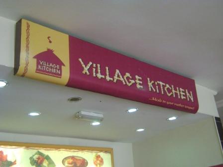
The less famous
subbrands of uac restaurants weren’t left out of the rebrand . I thought they also would've suffered some identity pounding from the ‘mouse- wielding thugs’ at the
design office responsible for the rebrand, but they came out okay. Wonder why? Well, it would appear that the company to whom the 'inn' franchises belong (with the exception of village kitchen) is not uac but innscor international . Hence the better looking images and overall branding. (I for say!!)

 |
| our very own village kitchen, looking better. |


| uac should collect the phone number of the company handling innscor's branding or better yet, they can call me. no really they can |
Okay, so heres my grouse, Mr.Biggs had a (cant help it) BIG
opportunity (pun most definitely intended and executed) here to really make
their competition think twice before stepping to the market leader of Nigeria’s
QSR industry. They could’ve wowed the industry, the customers and the
competition, but instead they find themselves playing catch up while the competition is laughin and slowly marchin on to ‘takeover’
land.
The rebrand was painfully cosmetic, the food’s still the
same, no change in menu, a little change in ambience as claimed, no attractive play
areas for kids, (at least not that I’ve seen ). Nothing innovative or
different, just a crappy new logo, a couple of uniforms, some paint on the
walls, new furniture and voila!! We have re-branded. Its much, much, much more than that. The
Nigerian market is very different from 2 decades ago, with social media and
all, so its sad to see Mr.Biggs with a puny 1000+ likes on a less than
captivating facebook page(Mc donalds has 25 million by the way). Heck I have half of that on mine (gotta toot the
horn y’know). There’s no tangible
marketing message or ad campaign to support this rebrand, one that would have
had kids lining up in their outlets nationwide. Instead this rollout just seems
like nationwide renovations of old restaurants and oh! Look a new logo.
In this day and age of ladies wanting to lose weight and
people wanting to eat healthy, they could have introduced a line of dishes for
this very big market. They could’ve emulated Mcdonalds with their Mc Café or
dollar menus and provided similar products to expand their market share even
further.


But they stuck to their guns and brought nothing new. This rebrand could’ve been a triumphant undertaking like Gtb
in 2005 which saw it expand aggressively and become Nigeria’s “biggest and most
profitable bank” (see Wikipedia article), but it just didn’t do much, Mr.Biggs
is still the Mr.Biggs that has fallen off in everybody’s mind. That’s the
perception and this rebrand did little to change that, it still persists,
and that, my dear friends, is why they missed it.
Check out this Cool Mr. Biggs ad.
Well articulated article which was more like a SWOT analysis of the brand.
ReplyDeleteAs always with Nigerians, we give our opinion but it always better to give our opinion based on facts and not just whim. The writer here has many good points but am a fan constructive critisms. THe author lacks that a great deal in writing his 'ópinion'
ReplyDeleteHi there anonymous, i'd really like to know the facts. I tried getting my hands on relevant information regarding the rebrand but came up with very little. I'm also a stickler for constructive criticisms and i think my opinion was, but i'm open to other areas my eyes may have been unable to see...also i'm a professional designer so i know a thing or two about design hence my somewhat biased focus.
DeleteWell well... Good piece.
ReplyDelete