
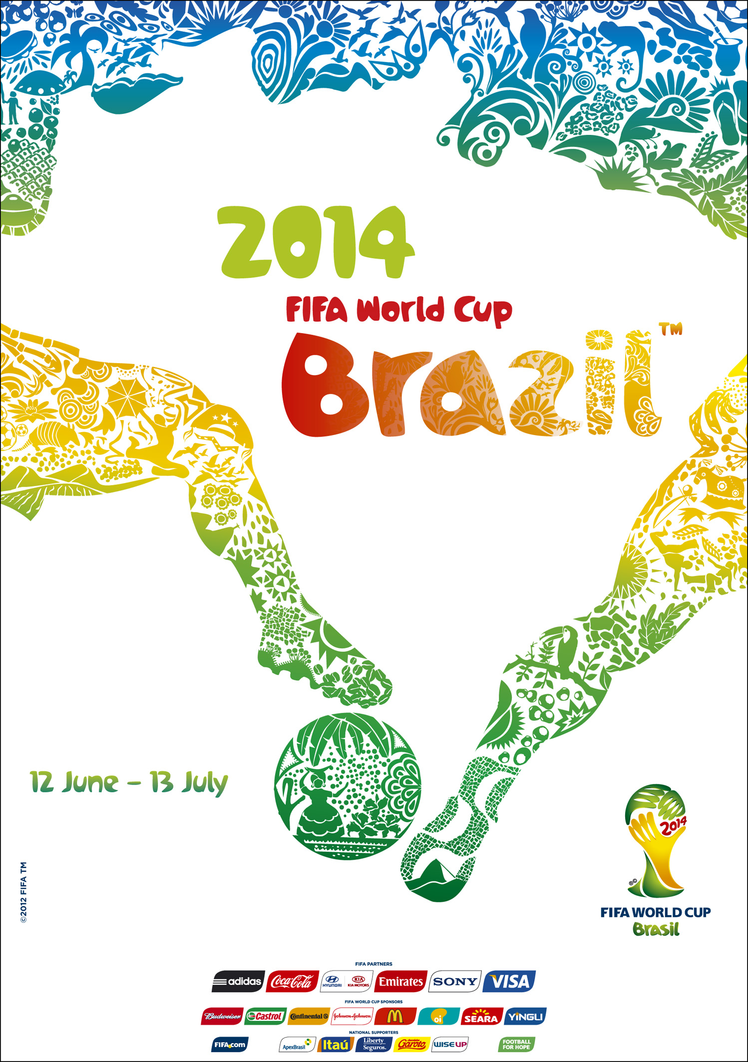
In the spirit of the ongoing Brazil 2014 FIFA World Cup. I thought it'd be nice to take a look at the official logo, designed by Brazilian agency Africa.

So we arrive at 2014 and after proposals from 25 different agencies judged by Brazilian celebrities such as super model Gisele Bündchen, architect Oscar Niemeyer (amongst others) a choice was made.
| why the huge copyright symbols? why? |
The winning design referred to as “Inspiration”, is inspired (pun intended) by an iconic photograph of three victorious hands together raising the world’s most famous trophy (the world cup..duh!?).
The symbolic warm yellow and green is a nod to the national colurs of the host nation as they seek to welcome the world to their home.
| thankfully, they reduced the size on the copyright symbols |

However, the design wasn't without its faire share of detractors (isn't everything?) There were those who felt some kind of way about the design and chose to do something about it.
In 2010, Felix Sockwell attempted "fixing" the Brazil 2014 logo.
“There are so many things wrong with this logo, but I will agree that its premise, or idea, was OK. Let me take a few minutes to tell you whats wrong with this mark and what I would do to quickly amend it.”
— FELIX SOCKWELL
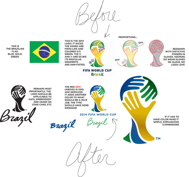
| the final iteration from Mr.Sockwell, better? |
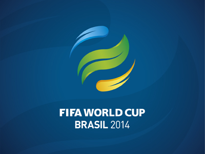
Following Mr. Sockwell, a number of other designers took to their mice (or mouses!)
 |
| talk about having the world in your hands |

and some people just chose to visually represent their dislike of the brazil 2014 logo, hence, the famous "facepalm" concept.

I, for one, think the shortcomings or "things that are wrong with the logo" add to its character and originality. yes!, the hands seem poorly illustrated, maybe!, the type is not everyone's cup of tea, possibly! the 2014 need not be where it is, but, I see all of that as what makes this design striking and dare I say, different. Its not following certain rules and principles and that, my dear friends, is what makes it art. Yes its a branding project, but its also a cultural one that's seeking unite 30+ diverse nations in sport so a bit of socially acceptable art isn't all that bad. What are your thoughts on the visual representation of this years mundial? hit us up in the comments. God bless.
No comments:
Post a Comment