
Speak Up Africa is a creative communications and advocacy agency for public health.
So knowing that and seeing the logo reduces the need for an explanation. But nonetheless, allow me.
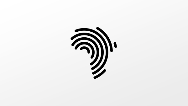
Firstly, only the most intuitive designers are able to pull of genius level solutions with some of the simplest more elegant forms known to man. In the words of Meirs van der Rohe, "less is more", and to say that this project displays that would be, well,....an understatement.
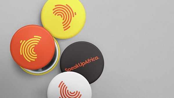
In the words of the designers DIA, “The logo mark nods to speech and sound with the use of wave forms, while being contained within the iconic shape of the African continent.” , nuff said.
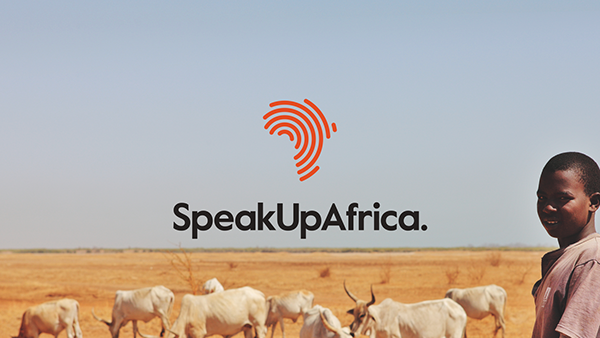
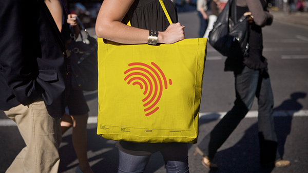
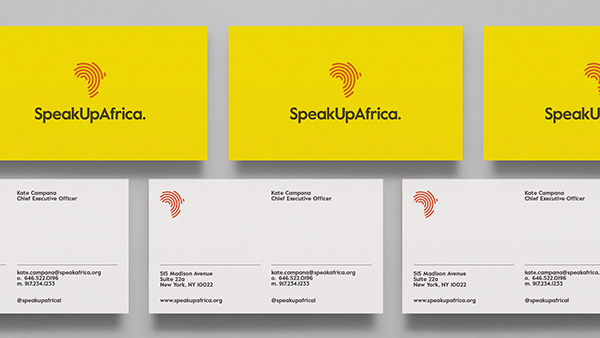
The logo speaks for itself. You get the idea on sight in the simplest of terms, plus it looks good on just about anything.

And just in case you're thinking pulling of a simple looking solution is easy, THINK AGAIN!! It takes time, thought and effort to finally arrive at something that seems so effortless. So i say Kudos to DIA for this fabulous piece of work.
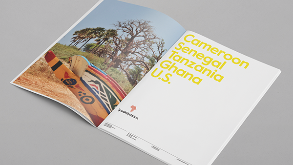
Take a look at the Speakup full project and drop a thought or two.
God Bless.
No comments:
Post a Comment