Some time back in July 2013, President Goodluck Jonathan
launched the country's Tourism Identity, “Fascinating Nigeria”, as part
of efforts to develop the tourism sector and diversify the nation’s revenue
sources. The identity backed by a strong marketing campaign is meant to project
Nigeria to the world in a bid to " generate income and attract investment
to drive the country’s economy". The identity is a signal reiterating the government's
commitment to develop the largely untapped tourism sector of the 53 year old
nation.
Now to the critique...
The 'logo' is MEH! or as we say, 'Jus' there!' Yes!, they drew on the confluence 'y' from
our nation's map, Yes!, they had drums and sun, which to some extent define some
degree of our culture and geography but what's with the monkey in green? Even ABD
Funsho, a design and branding expert asked, "From all the wildlife in
Nigeria, why select a monkey as part of the image in a national branding and
repositioning logo"?
The type face with
the ribbony swoosh underneath is not really my cup of tea and don't get me
started on the 'fascinating' signature.
All in all it just seems bland and like a largely missed
opportunity to wow and dazzle the international community, but then again, how
much good can a tourism brand do for Nigeria? Well, maybe if it was more
engaging and less, well, un-fascinating, it might just spark some interest. All
nations have bad press and some degree of a dark side, hence the need for good
branding, To build the right kind of perception. This project just puts up
Nigeria as yet another country with a tourism sector, but, in my opine, does
not do much to invite one in. I know looking at just the logo without the
context within which it was developed doesn't give the full picture , but thats
just it, this is more or less the high point of the identity. There's no real
visual language to go along with it, no real IDENTITY other than the bland and
dare i say, uninspiring composition. Theres little or no cultural references or
inferences other than the drum, sun and monkey(sorry, baboon) as well as the
confluence 'y', but i strongly believe, as a Nigerian, and as a designer,
theres a whole lot more to offer than that. Honestly, its all just looks rushed
and hurriedly put together.
The official website also shows some inconsistency with the
logo, only the confluence mark (thats what i'm calling it now) remains
constant. The site is also a bit lack lustre and could pass for any random site
amongst the billions of them online.
It, to me, doesn't scream Nigeria as it
should. Design credit goes to emerging platforms for the site, though if you
ask me, they could have done better. But i guess, they had little to go on. I
do however, like the fun facts at the BOTTOM OF THE SITE...SERIOUSLY!!!, that
should have been way more conspicuous. Those are national usp's and unique
facts that would help sell the idea, they should have led the way, to some
extent at least. The magazine section has a bit more life and little more energy but it all still just feels incomplete.
please note the pronunciation of the word 'fascinating'.
A chance to display the rich uniqueness of Nigeria was missed here. I
tend to watch cnn alot and am well versed with the advertising of a plethora of
destination brands like monte negro, romania, azerbaijan, warsaw, egpyt etc. and
one thing common to them is that they all show something unique about their
country.
Looking at ours side by side other nation branding efforts
shows just how unfascinating ours really is...

You get a sense of some representation of each country that is cleverly executed.
Even on their sites, and general look and feel, you can see the difference.
Egypt with the ankh as the 't'. (an ankh is known as the key of the Nile, so you see how that fits)
for more on egypt go here.
Peru with the contours of its archaeological sites . The logo was also conceived to be used in the packaging of peru's exports and even had its own custom typeface created.
Romania with its garden.
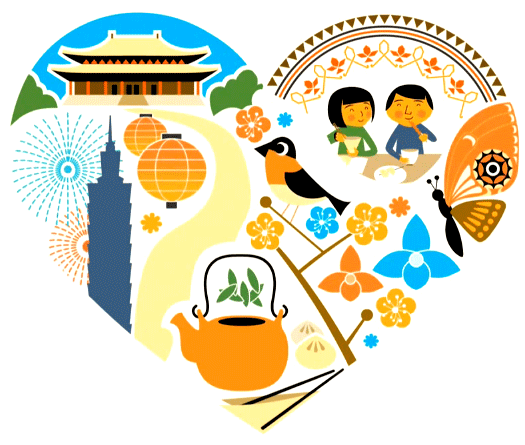
Taiwan with its architecture, activities and ambience etc.
want more?...here.
Australia with its sun and kangaroos,
Nigeria's logo (or identity) has some degree of representation, but just with poor execution and a lot less though put into it.
My country suffers from a lot of problems and or issues, but
its tourism sector remains a gold mine that despite its shortcomings is
very viable, but, putting this identity as our best foot forward to attract the world, is in a
word, disappointing. So much more could have been done, a golden opportunity
was sorely missed here to truly and sincerely capture the essence of this destination.
Well, what more can i say, I'm Naija till i die. B'NG.


Great Stuff
ReplyDelete