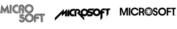
The Largest, most popular tech giant of all time has unveiled a new look..(well they did so sometime in August), Microsoft have gone minimalist to be able to have a more cohesive brand architecture for the plethora of brands under them. It has been 25yrs since Microsoft last updated their look and I must say I like it. Simple and strong at the same time.
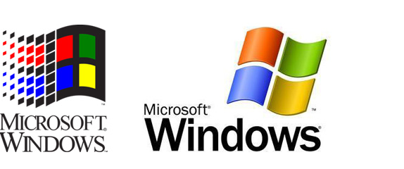
The visual evolution of the Microsoft brand from 1975 to date.
The new look Microsoft launch video.
Our dear MS Office is not left out in this rebranding...they've gotten to a point where they don't even need to say 'Microsoft office' just 'Office will do. Some more gist on their official blog here.
Images courtesy Armin on Brand New, for more go here

No comments:
Post a Comment